Designing Trust-First Banking Onboarding & Verification Operations
Orizon Mobile App + Admin Dashboard — UX Case Study
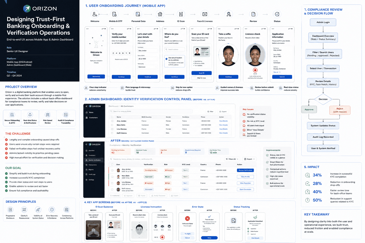
| Area | Details |
|---|---|
| Product | Orizon Digital Banking App |
| Users | New customers, low-confidence users, compliance reviewers, operations teams |
| Core UX Challenge | Reduce onboarding friction while preserving compliance and auditability |
| My Contribution | Journey mapping, service blueprinting, dashboard IA, mobile flow redesign, UX writing, decision-flow design |
| Outcome | Clearer onboarding, stronger recovery paths, faster admin review, better status visibility |
About the project
Designing a trust-first onboarding and verification ecosystem for Orizon
Orizon is a digital banking platform that enables users to register, verify their identity, and activate their account through a mobile-first onboarding experience. Behind the customer app, back-office teams use an admin dashboard to review verification submissions, make compliance decisions, and keep the onboarding process audit-ready.
This project was not only about improving screens. It was about designing a connected system where mobile onboarding, identity verification, dashboard review, status updates, and audit logs worked together as one experience.
Problem
Why Orizon onboarding and verification needed redesign
The original onboarding journey was secure and compliant, but the experience felt fragmented. Users had to complete several sensitive steps, including ID scan, face verification, liveness check, and signature submission. These steps were important for compliance, but they increased friction when the purpose, progress, or recovery path was not clear.
At the same time, the admin dashboard worked more like a basic customer directory than a verification control system. Admins could view customers, but they lacked clear visibility into verification status, risk level, pending cases, rejected cases, and next-best actions.
Core question
How might we create a trust-first onboarding and review system that helps users complete KYC confidently while helping admins review cases faster and more consistently?
- Users lacked confidence during sensitive KYC steps.
- Verification status and next steps were not always visible.
- Failed scans and rejections created weak recovery paths.
- Admin teams needed better prioritisation, status visibility, and decision support.
- Compliance decisions needed to remain traceable and audit-ready.
Process
A structured process for solving compliance complexity
I used the Double Diamond method to move from ambiguity to clarity.
Discover
I explored the problem broadly by reviewing onboarding flows, dashboard screens, support feedback, and operational constraints.
- Stakeholder interviews with product, operations, compliance, and engineering.
- Flow audit across mobile onboarding and admin review.
- Support insight review around KYC confusion, retries, and status uncertainty.
- Competitive review of fintech onboarding patterns.
Define
I identified the highest-friction areas and separated user problems from operational problems.
- ID scan, face match, and liveness were the highest-friction steps.
- Users needed better explanation before sensitive actions.
- Admins needed status, risk, and context at list level.
- Rejection and resubmission needed clearer loops.
Develop
I explored improved flows, dashboard information architecture, and new decision paths.
- Improved onboarding flow.
- Verification dashboard structure.
- Case detail review workspace.
- UX writing improvements.
- Status and audit flow mapping.
Deliver
I documented the final experience through annotated screens, flows, matrices, and implementation-ready UX decisions.
Flow redesign
From a linear, document-first flow to a progressive, recoverable one
Before
Existing flow — secure, but cognitively heavy
The original onboarding journey followed a linear, document-first process. Users were asked to complete verification-heavy tasks early, while personal data and status clarity appeared later in the experience.
- High upfront complexity — Users encountered heavy verification before building trust
- Personal data appeared late — The journey felt less natural and less progressive
- Weak recovery paths — Failed verification could feel like a dead end
- Low status visibility — Users were unsure what happened after submission
After
Improved flow — a clearer, more progressive verification journey
The improved onboarding flow was redesigned around progressive disclosure. Instead of overwhelming users early, the journey introduced steps in a more natural order: first confirming phone ownership, then collecting personal data, then asking for sensitive verification actions with better guidance.
- Personal data moved after OTP — Builds flow logic after phone ownership is confirmed
- Address support added — Reduces typing and improves accuracy
- Use actual location as address — Makes the CTA more explicit and understandable
- Skip for now for ID capture — Reduces drop-off without removing compliance requirement
- Guided face and liveness capture — Improves success rate and user confidence
- Review before submit — Gives users control before final submission
- Status tracking — Reduces anxiety after submission
Service blueprint
Connecting the visible user journey with back-office operations
The onboarding journey did not end when users submitted their application. Each mobile action triggered system checks, dashboard updates, reviewer decisions, and user notifications. The service blueprint helped map what happened across four layers.
| Moment | System / dashboard dependency |
|---|---|
| User uploads ID | Backend validates image and OCR; dashboard shows document evidence |
| User completes face / liveness | Biometric results appear in review workspace |
| User submits application | Case is created with risk and status indicators |
| Admin approves / rejects | App status and audit log update automatically |
| User needs to resubmit | Dashboard reason maps to a clear user-facing next step |
The most important insight was that back-office review is part of the user journey. If the dashboard decision is unclear, delayed, or poorly structured, the user experience also suffers through uncertainty, delayed activation, or confusing rejection messages.
Dashboard redesign
From "All Customers" to "Identity Verification Control"
The customer listing screen was clean, but it behaved like a generic CRM table. For a KYC operation, admins needed richer status visibility and prioritisation.
Before
Before
Basic customer lookup table.
- No verification status at list level — Admins had to open each case to understand its state
- No risk signal — High-risk cases could not be identified at a glance
- No KYC tier visibility — The required review depth was hidden from the list view
- Every row looked equally important — Urgent cases had no visual priority
- Generic "View Details" action — Admins lacked context for why a case needed attention
- Search was limited to basic lookup — Finding a specific verification case took longer
After
After
Identity verification control panel.
- KPI header — Gives operational context at a glance
- Smart search — Supports search by name, phone, ID, verification ID
- Structured filters — Helps admins find cases by status, risk, KYC level, country
- Status badges — Makes verification state visible immediately
- Risk pills — Helps prioritise high-risk users
- Contextual actions — Reduces admin thinking and speeds action
- Row priority indicators — Guides attention to pending, rejected, or escalated cases
From customer directory to verification operations system
A decision-focused workspace for compliance review
| Section | Purpose |
|---|---|
| User profile | Identity, contact, application reference |
| Verification checklist | ID, face match, liveness, signature |
| Evidence panel | ID images, video, signature, extracted data |
| Risk signals | Device, fraud, sanctions, duplicate signals if available |
| Decision panel | Approve, reject, request resubmission, escalate |
| Audit log | Records who did what, when, and why |
Final screens
Key screens that show the redesigned experience
Mobile app final screens
- Welcome
- OTP
- Personal Data
- ID Scan
- Face Match
- Liveness Check
- Review & Confirm
- Application Submitted / Status Tracking
Dashboard final screens
- Dashboard overview
- Identity verification list
- User case details
- Verification workspace
- Audit trail / status update
- “Status badges reduce blind case opening.”
- “Risk indicators help admins prioritise.”
- “Review summary reduces submission errors.”
- “Status tracking reduces post-submit anxiety.”
- “Audit log supports compliance traceability.”
Outcomes
What changed after the redesign
The redesigned system improved both the customer journey and the back-office workflow. The mobile app became more guided, while the dashboard became more action-oriented.
| Outcome | Impact |
|---|---|
| Successful KYC completion | +34% — increased through clearer guidance and better recovery paths |
| Onboarding drop-offs | -28% — reduced by making the flow more progressive |
| Review time for back-office teams | 40% faster — admins could triage and review with better context |
| Support queries related to KYC | -50% — reduced through clearer status and rejection messages |
| Admin productivity | +60% — improved through filters, status badges, and quicker decisions |
| Audit readiness | Improved through structured decisions and recorded reasons |
Metrics are presented as indicative and directional, based on internal comparison — consistent with how this case study is shared publicly.
Deeper dive
Process detail, matrices & appendix
Expand any section for the supporting research and decisions behind the work above.
The user journey map helped identify where users felt confident, confused, or anxious. The lowest confidence points appeared around ID scan, face capture, liveness, and waiting for approval.
| Stage | Feeling | Pain point | Opportunity |
|---|---|---|---|
| Welcome | Curious | Unclear time expectation | Set onboarding expectations early |
| OTP | Slightly anxious | Code delays | Resend timer and clear state |
| Personal data | Neutral | Repetitive inputs | Smart defaults and validation |
| Address | Unsure | Why is address needed? | Explain and support with autocomplete |
| ID scan | Nervous | Fear of poor capture | Camera guidance and skip option |
| Face / liveness | Anxious | Fear of failure | Friendly instructions and retry path |
| Review | More confident | Need final confirmation | Review summary before submit |
| Status | Waiting | Uncertainty | Real-time status and clear next steps |
Reflection
What this project taught me
Trust is a UX outcome
In fintech, users do not only judge the app by how it looks. They judge whether they understand what is happening, why information is required, and what happens next.
Error handling is part of the product experience
Failed ID scans, failed liveness, or rejected verification should not feel like dead ends. A strong recovery path can protect both trust and completion.
Operational UX matters as much as customer UX
A weak internal tool creates delays, inconsistent decisions, and poor user communication. Designing for admins improves the customer experience too.
Compliance works best when UX is involved early
Compliance requirements do not have to create poor experiences. When UX is involved early, secure flows can still feel clear, human, and manageable.
Closing
Final reflection
Orizon was a complex fintech UX project where the real challenge was not only designing a mobile onboarding journey, but designing trust across an entire verification system.
By connecting customer onboarding, identity verification, admin review, status updates, and audit trails, the experience became clearer for users and more scalable for operations.
This project strengthened my ability to design regulated digital products where user trust, business goals, compliance, and operational efficiency must work together.
The strongest UX outcome was not just a cleaner interface — it was a clearer, more trustworthy verification journey for both customers and the teams supporting them.